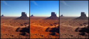
Like the chef who can’t enjoy a meal at a restaurant without commenting on all of the ingredients contained within his meal, we have a hard time just enjoying a movie. We usually slip into the habit of examining the camera moves, audio and editing decisions from a critical standpoint. Color styling is also an area frequently inspected.

Color correction (or color timing as it is also known) is critically important to accurately portraying the story as the screenwriter and director originally intended. The correct use of color can enhance or detract from the show. It can change the mood from upbeat, to somber. Subtle changes to hue and tone can be introduced to help move the story along. Scenes can be enhanced, or even salvaged if, for example, a particular shot was supposed to take place in bright daylight, when it was shot during a gloomy, overcast day.
On television, you may have noticed as well the change in the portrayal and intensity of color from the over-saturated TV of today, to the more de-saturated look of the 70’s, to the almost Technicolor-look of the 60’s. This shift over time may have had more to do with the available film stock than actual creative choices made during production of these shows.
At Carolwood, we spend a good amount of time working with the image of our productions. We recently calibrated 9 different “looks” within our high definition gear. This process was accomplished over the course of a long, three-day marathon session involving testing in both daylight, controled lighting, and low-light situations.
